Google Messages Pinned Chats Get an iMessage-Style Redesign and a Floating Search Test
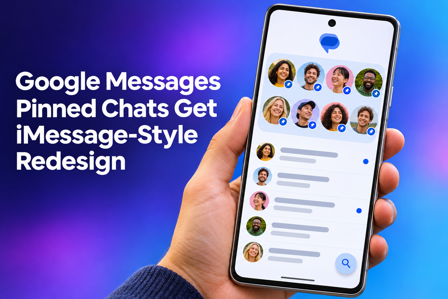
Google Messages is getting a redesigned home for pinned chats. Your pinned conversations move into their own section above the regular list and show up as large circular contact photos. Android Police reports that Google has started rolling out the new interface, along with a change meant to make searching conversations easier. It matters because it changes the first thing you see when you open the app, and it trades some information for a cleaner look.
There's a catch: not everyone has it. Android Police describes the rollout as underway, while Android Central says the redesign is only beginning to reach beta testers. Either way, availability is patchy, so you may be reading about a layout your own phone doesn't show yet.
What the new Google Messages pinned chats layout looks like
Right now, pinned chats sit at the top of the normal conversation list. The new layout pulls them out into a separate section at the very top, showing each contact as a large circular photo with their name underneath. Android Police says the change gives the app a more iMessage-inspired look, and the Android Central author also compares it to Apple's iMessage. Android Police credits Android Authority with spotting the redesign.
The look isn't the only difference. According to Android Police, you can no longer glance at the last message or recently shared content in a pinned conversation without opening it. If you've been using pins as a quick preview of what your closest contacts just sent, that habit will need to change.
Why you might not see the new pinned chats yet
The rollout appears to be controlled by a server-side switch, which means Google flips it on for you rather than you installing something. Android Police says users on the latest version of Google Messages are reporting only the new gradient-style app icon, not the new pinned layout. That icon began rolling out about a day before Android Police's November 4, 2026 article. The Android Police author also said he still wasn't seeing the new interface on his Pixel 11 Pro, and that users may have to wait longer even on the latest version. That's one person's experience, not a rule.
Android Central points the same way. Some people on beta version 20261030_00_RC00 received the redesign while others on the same build did not. The original Reddit poster said he got the new interface on a Pixel 9 Pro without any extra Play Store updates, which suggests the switch sits on Google's side. In practice, updating the app again probably won't force it. Android Central also notes that some testers have seen different interface changes on their devices, so what you get may not match what someone else gets.
Moving your data to a new phone
If you're thinking about a new phone, such as one of the Pixels mentioned above, you'll want your chats, photos and contacts to come along. People often search for a "simple transfer", or phrases like "copy my data" and "transfer my data", because the goal is the same: not starting over. There are several ways to do it, and one of them is Smart Transfer, an app for Android and iPhone.
Its Clone tool handles Data transfer between Android and iOS phones and tablets over Wi-Fi, covering pictures, videos, contacts, messages, apps and more. That includes Sms Transfer, since messages are among the things it can move. For File Transfer, Share Nearby sends pictures, videos, music and files to people on the same Wi-Fi, and Share Remotely sends files across networks, including to other countries. There's also a Backup and Restore tool for contacts and bookmarks.
The floating search button test
The other change is about search. Android Police says the new design adds a floating search button next to the "Start chat" button, so you don't have to scroll back to the top to search. Android Central describes it as an experiment in which search leaves its usual spot and becomes a floating action button beside "Start chat". The button alternates between a circular magnifying glass and a pill-shaped search button depending on your scroll position.
Treat this one as a test, not a finished feature. Android Police points to 9to5Google's report that Google is testing the button, and Android Central also calls it an experiment. Nothing in either report says it will ship in this form.
Pros and cons of the iMessage-style design
The upside is visibility. Pinned conversations get their own space, and the big circular photos make your favorite people easy to find at a glance. The downsides are practical. Android Central's author says the larger photos push recent conversations lower on the screen, so you scroll more to reach unpinned messages. Add the loss of message previews in pinned chats, and the new layout costs you some information.
There's also a visual quirk. A Reddit user pointed out an awkward empty pin placeholder that appears when you only have a couple of pinned conversations. According to the original poster, adding more pinned chats makes the empty space disappear. The Android Central author also thinks heavy texters might not like the change, and says he'd prefer a way to switch between compact and expanded pinned chats. That's his opinion, and no such option has been reported.
What users are saying about the redesign
Reactions on Reddit, as summarized by Android Central, are split. Some people welcomed the change, saying pinned conversations are easier to spot and the interface looks better. Others argue the iOS-inspired layout makes the top of the app feel cluttered. Some testers have also complained about choppy animations, which isn't unusual for a feature still being tested.
If you don't see the redesign yet, there's little to do except wait. Check Messages occasionally, and if you do get it, try pinning a few more chats to see whether the empty placeholder goes away. Whether the layout feels like a tidy upgrade or a cluttered one will probably depend on how many chats you pin and how much you relied on those previews.
Google's pinned chats redesign is a visible change with real trade-offs: easier-to-spot favorites on one side, lost previews and extra scrolling on the other. With the rollout controlled from Google's end and the floating search button still a test, expect the final result to differ from what early testers are seeing.


Comments
Post a Comment